
Solana posted a daily hammer and climbed back above the 10 day and 20 day EMAs, signaling fresh demand after the recent dip. Meanwhile, a separate daily chart still tracks $SOL inside a long descending channel, keeping the next resistance test in focus.
Solana prints daily hammer and reclaims short term averages
Solana traded near $87 on the daily SOLUSD chart after a rebound that pushed price back above two short term moving averages. In a post on X, trader gnarleyquinn said $SOL formed a “massive hammer candle” and closed above the 20 day EMA and the 10 day EMA.
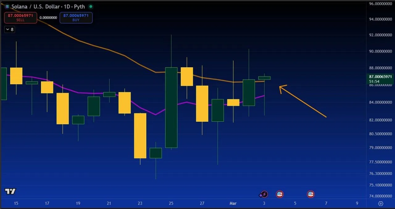
Solana US Dollar Daily Chart. Source: gnarleyquinn on X
The chart shows a sharp dip below $80 earlier in the stretch, followed by a strong recovery candle that erased much of the prior day’s drop. That move left a long lower wick, which often signals buyers stepping in after a fast selloff.
After that rebound, the latest candles held around the mid to high $80s. Meanwhile, the 10 day EMA (purple) turned up and ran under price, while the 20 day EMA (orange) flattened and sat near the current zone.
Even so, the same chart shows repeated wicks into the upper $80s and low $90s, which points to selling pressure overhead. As a result, $SOL now sits between a defended sub $80 area and an upper band where recent attempts have stalled.
Solana Descending Channel Structure Points to Possible Breakout Scenario
A SOLUSDT daily chart shared by analyst Satoshi Flipper on X shows Solana moving inside a long descending channel. The structure formed after a previous peak, with price creating a sequence of lower highs and lower lows within two parallel downward trendlines.
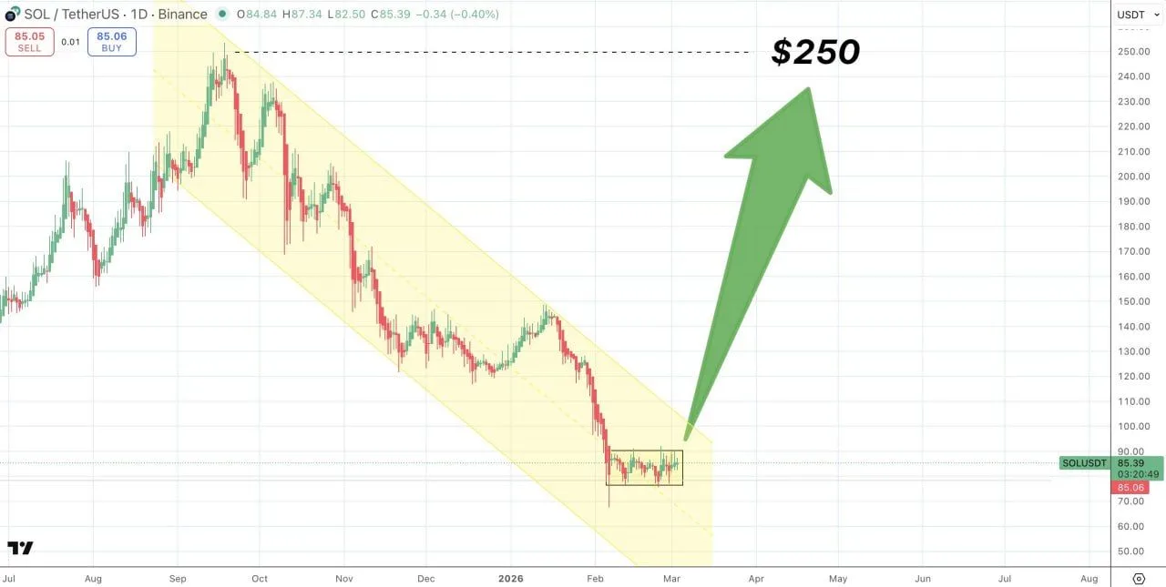
SOLUSDT Descending Channel Pattern. Source: Satoshi Flipper on X
The chart highlights several rebounds inside this channel, where price repeatedly approached the upper boundary before turning lower again. Each rejection reinforced the descending pattern, keeping the broader structure intact.
Recently, the candles formed a tight consolidation zone near the lower section of the channel. The range shows multiple small candles grouped together, suggesting temporary balance between buying and selling pressure.
The chart annotation points to the upper channel boundary as the key level. According to the analyst’s projection, a break above that resistance could invalidate the descending channel and open a path toward the $250 area shown on the chart.